Do grammar schools that select on test score get better results?
Every grammar school takes only children who pass the entrance test — but when more pass than there are places, schools break the tie very differently. Some rank by test score, others purely by how close you live. We joined the admissions rule of all 163 grammar schools in England to their official DfE results to see whether that choice shows up in outcomes. It does.
Three numbers that sum it up.
Passing the test is only the first gate.
Grammar schools are academically selective: you have to pass the 11-plus to be considered at all. But passing is common — far more children qualify than there are places. So the rule that really decides who gets in is the oversubscription tie-break: how a school chooses between qualified applicants once it has too many.
Those tie-breaks fall into a spectrum, from purely academic to purely geographic:
- Test score only — the highest scorers in the whole region get in (“super-selective”).
- Score, then distance — ranked by score, with distance only as a final separator.
- Area, then score — a defined catchment area first, then the top scorers inside it.
- Area, then distance — a defined area first, then the nearest qualifying children inside it.
- Distance only — no area, no ranking by ability: just the nearest qualifying children.
The first three lean on the test score; the last two lean on geography. Does that choice correlate with how the school actually performs? We took the admissions model recorded for every grammar school on GrammarBound and joined it to their latest DfE Attainment 8, Progress 8 and A-level figures.
The more a school ranks on score, the better it does.
Order the five models by raw GCSE result and the picture is almost a clean staircase — and the two leftmost, top-performing groups are exactly the ones that rank on test score (gold).
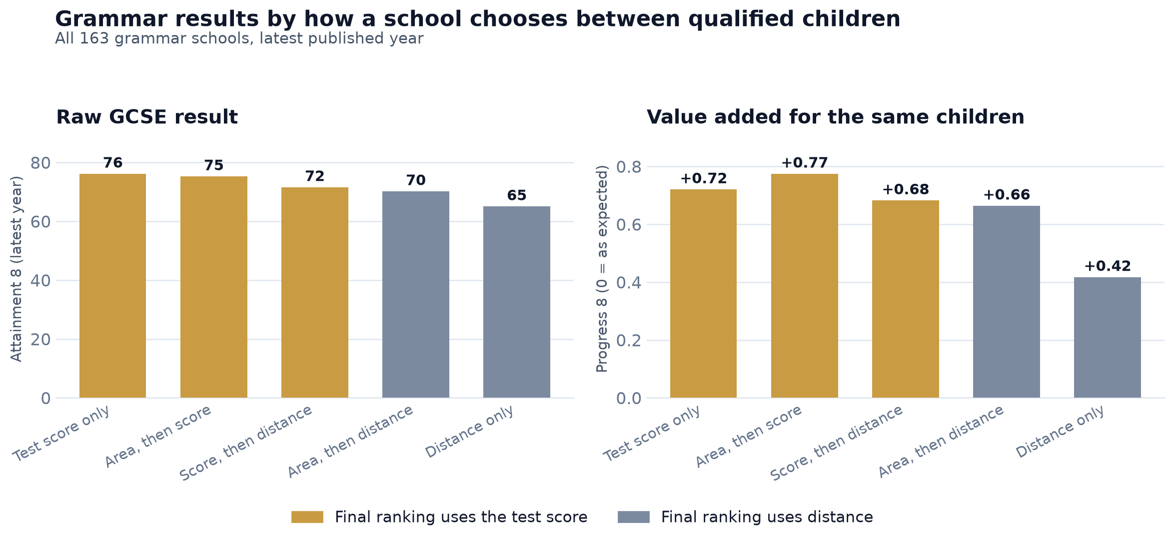
But raw results can mislead. A school that admits the highest scorers in the county will of course post the highest GCSE grades — that’s the intake, not the teaching. The honest question is whether the school adds more value to whichever children it gets. That is what Progress 8 measures: it compares each child’s GCSEs to children who started from the same primary-school baseline nationally.
On that intake-adjusted measure (right-hand panel) most grammars cluster around +0.7 — but the distance-only schools fall away to +0.42. The admissions model still shows up after you strip out the head-start of a stronger intake.
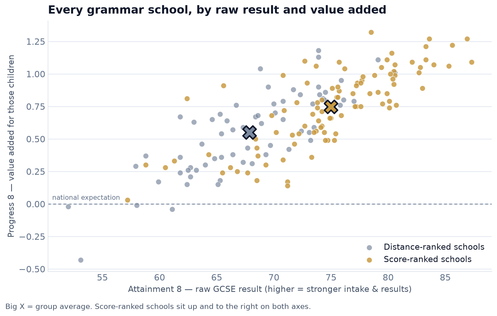
It holds across the whole cloud, not just the averages.
Plot every school as a dot — raw result across, value added up — and the two groups separate. Score-ranked schools (gold) sit up and to the right; distance-ranked schools (slate) sit lower and to the left. The big crosses mark each group’s average.
But is it really the admissions model — or just geography?
There is an obvious objection. Super-selective, score-only schools cluster in London and big cities; distance-only schools are common in Kent and the East Midlands. Perhaps the gap reflects the kind of area a school sits in — city versus county, and everything that comes with that — rather than how it admits.
So we re-ran it within a single region — the 57 grammars of the South-East, almost all using the same Kent-style entrance test. The cleanest comparison is the two “defined area” models: they share an identical front door (a named catchment), and differ only in how they rank the children inside it.
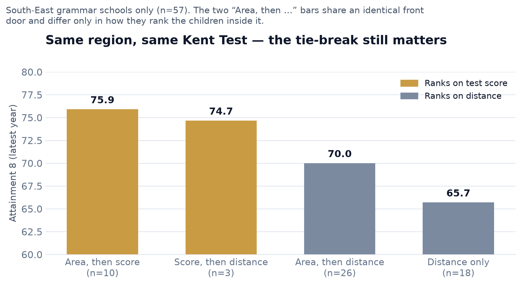
| South-East model | Schools | Attainment 8 | Progress 8 | A-level pts |
|---|---|---|---|---|
| Area, then score | 10 | 75.9 | 0.81 | 42.6 |
| Score, then distance | 3 | 74.7 | 0.68 | 40.9 |
| Area, then distance | 26 | 70.0 | 0.68 | 40.7 |
| Distance only | 18 | 65.7 | 0.44 | 36.6 |
Same county, same test: filling a catchment by test score is worth roughly six Attainment 8 points over filling it by distance — and the value-added edge survives too. The pattern is not just London super-selectives flattering the average.
How to read this if you’re choosing schools.
Don’t read it as “score schools teach better.” Most of the raw-results gap is intake: a school that admits the top scorers in the region starts from a higher base. The value-added gap is real but much smaller — and Progress 8 is a contested measure for grammar schools, so read it as suggestive rather than decisive.
Do read it as a signal about the admissions ladder. If you’re aiming at a score-ranked or super-selective school, the test mark matters enormously — a pass alone won’t secure a place, so preparation and the exact score carry real weight. If you’re looking at a distance-only school, your postcode is doing most of the work: a pass plus the right address beats a higher mark from further away.
That is exactly the distinction GrammarBound is built to show. For any postcode we map the real published catchments, the latest distance cut-offs, and each school’s tie-break — so you can see whether your child’s chances rest on the test mark or on the map.
See how each school admits — for your postcode
Real catchments, distance cut-offs and tie-break rules for every grammar in England.
Or browse the national rankings to compare results side by side.
How we did this.
- Schools. All 163 grammar schools currently on GrammarBound, each tagged with its admissions model (test score only, score then distance, area then score, area then distance, or distance only) taken from its published admissions arrangements.
- Results. Latest available year from official DfE / Ofsted data — Attainment 8 and Progress 8 (KS4), average A-level points (KS5). Figures are school-level averages, not adjusted for anything beyond what each measure already adjusts for.
- “Score-ranked” vs “distance-ranked” groups the five models by whether the test score enters the final ranking. Means are unweighted school averages within each group.
- Caveats. This is a correlation across schools, not a controlled experiment — admissions model, location, faith status and intake are tangled together. Some within-region cells are small (e.g. just 3 “score, then distance” schools in the South-East). Progress 8 is itself a contested measure for grammar schools: research finds that noisy Key Stage 2 baselines can flatter high-attaining intakes (FFT Education Datalab, 2016), which would inflate the score-ranked schools’ figures in particular — so the value-added gap is best read as suggestive, not proof of better teaching.
The wider evidence.
The tie-break comparison above is our own analysis, but it sits alongside an established body of research on academic selection, value added and how admissions rules shape a school’s intake:
- Education Policy Institute (2016) — Grammar schools: 8 conclusions from the data Once prior attainment is controlled for, grammar pupils do no better than similar pupils in high-performing comprehensives — evidence that the raw-results advantage is largely selection, not school effectiveness.
- Gorard & Siddiqui (2018) — Grammar schools in England: a new analysis of social segregation and academic outcomes, British Journal of Sociology of Education Grammars raise social segregation and show little aggregate attainment benefit once intake is accounted for — context for why the area a school sits in matters as much as its admissions rule.
- FFT Education Datalab (2016) — Progress 8 is too favourable to grammar schools Noisy Key Stage 2 baselines can flatter high-attaining intakes on Progress 8 — why we treat the value-added gap as suggestive rather than proof of better teaching.
- Department for Education (RR038) — The effect of changes in published secondary-school admissions on pupil composition Changing a school’s admissions criteria measurably changes who it admits — the mechanism that links a tie-break to an intake.
- Cantley et al. (2025) — Consequences of academic selection for post-primary education in the UK: a systematic literature review, Review of Education A recent overview of the evidence on academic selection and its effects — a starting point for the wider debate.